Some time ago I started working on a crowd-forecasting app for my PhD (code). The app allows experts and non-experts to make predictions for the future trajectory of Covid-19. We use this app to submit case and death forecasts for Germany and Poland to the German and Polish Forecast Hub (as part of a pre-registered research project on short-term forecasting). So far this has proved to be surprisingly successful. According to our own evaluation, a crowd of around six people (edit: so far only six people have routinely submitted forecasts) currently outperforms all other models and ensembles submitted to the Forecast Hub. Overall, we want to achieve the following goals with the project:
- generate forecasts for the German and Polish Forecast hub
- Answer a variety of interesting research questions:
- do experts perform better than non-experts?
- how does the baseline model shown affect predictions?
- are some forecasters consistently better than others?
- do forecasters learn and improve over time?
- build generalizable tools for other tasks and future pandemics
Let’s have a look at the app, it’s predictions and how it compares against the other models in the Forecast Hub. But before we start: You can sign up and join the crowd-forecasting effort. Simply visit the app, choose a username and password and start predicting. You can also track your performance through our performance and evaluation board. We are happy about any contributions and especially your feedback!
How the app works
The app is a simply web app created with R shiny. While some of the details aren’t trivial, something like this is not too hard to set up (contact me if you would like to do something similar).
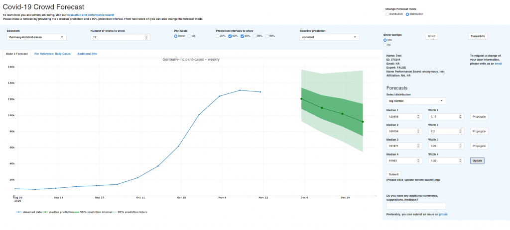
This is what the app looks like:
The following paragraphs explain how to make forecasts and what to pay attention to. Feel free to skip ahead if you’re more interested in the evaluation.
There is a large panel that visualizes your predictions. You can twist that a bit by selecting different prediction intervals (e.g. 50%, 90%, 98%) or show everything on a log scale. The panel on the right is used to make predictions. You can choose a distribution (really you should probably just stay with the default, ‘log-normal’), and specify the median and width of your forecast. You can either specify values by hand or you can drag and drop the points in the plot.
The median is the value for which you would say “I would think it’s 50:50 whether the actual value will be higher or lower”. If that is not intuitive, you can probably cheat a bit and just take the median as the value you find most likely (although that is not precisely correct, since the most likely value would be the mode). The width parameter changes your uncertainty. Let’s say you selected to show the 50% and 90% prediction intervals (this is the default). Then the light green ribbon shows you the range in which the actual observation should fall with 90% probability. The dark green ribbon shows you were 50% of the true observations should fall inside. If you believe that the number of weekly cases will be between 120.000 and 150.000 with 90% probability, then you should adapt the width of the distribution until this is true.
#/media/File:Visualisation_mode_median_mean.svg)
Usually, new forecasters tend to be too certain. It is ok to have wide prediction intervals and often better to err on the side of caution. Also, your uncertainty should increase over time as you are less sure about the far future than the next week. The width parameter should therefore be increasing from week to week. To help you with forecasting, additional information like daily case counts is shown if you select the appropriate tab in the large panel.
The app is open all the time, but the prediction target is weekly cases and deaths. The weekly data is updated every Saturday (at around 16.00 UTC). While you can of course make predictions before that, you will the last data point. Forecasts are collected every Tuesday at around 13.00 UTC, aggregated, and submitted to the Forecast Hub.
Forecast aggregation
The submission format that the Forecast Hub expects is based on a set of 23 quantiles. This means that the predictive distribution needs to be specified using 23 numeric values that mark different points of the distribution. We are asked to provide the values for which we believe that there is a 1%, 2.5%, 5%, …. 50%, …., 95%, 97.5%, 99% probability that the true observed case or death number will be below that value. To that end we compute this values from the predictive distributions of all forecasters and combine them. Currently we simply take the arithmetic mean, because it uses the most information. But one of the points on our agenda is to look whether a trimmed mean (the x% most extreme predictions are disregarded and the rest is averaged) or a median is better.
Here are last week’s (2020-11-23) predictions for cases in Germany as well as the ensembled prediction (all the plots in the post were automatically generated using the scoringutils package in R):
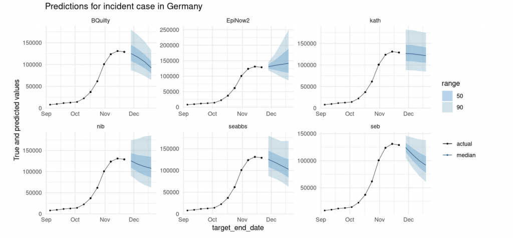

We can see that not all forecasters have uncertainty that increases with the forecast horizon. This will hopefully change in the future as we only started providing feedback on the forecasts two days ago. But, maybe apart from the very large uncertainty in the first week, the ensemble forecast looks quite reasonable.
Comparing forecasts over time
Let’s look at some of the forecasts we made for the Forecast Hub over time. The true values are always shown in black. All data points to the left of the forecast ribbons are the data that were known at the time the forecast was made. EpiNow2 is a computer model that we evaluated along with our own forecasts.

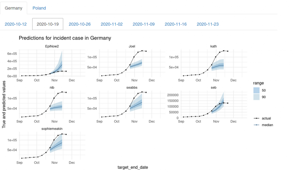
It is interesting to see that we (apart from the forecaster seb) completely missed the exponential nature of the trend in October. We missed it on 2020-10-12 and again on 2020-10-19. We missed it just like everybody had missed it in February and March and have learned little from it.
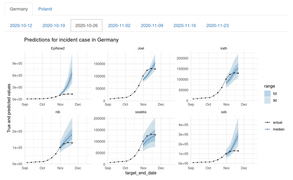
On 2020-10-26 we finally picked up the exponential growth, but at that time it was already starting to slow down.
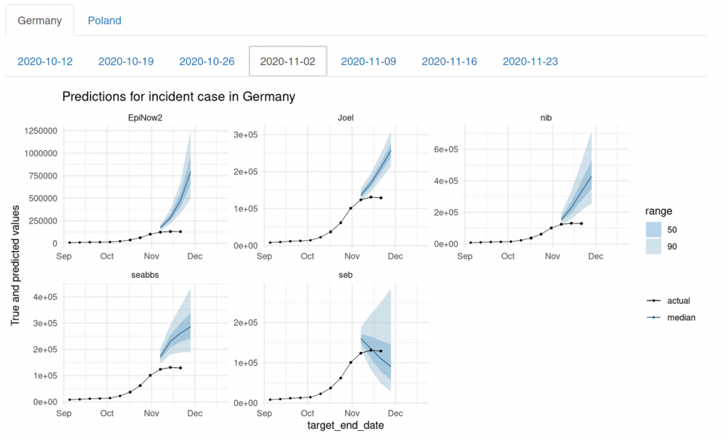
On 2020-11-02, seb was again the only one who predicted a changing trend – albeit too optimistically.
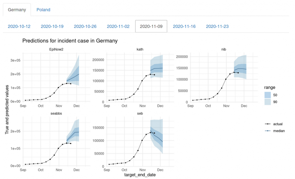
On 2020-11-09, the rest of us had mostly caught up. We maybe could have done better, but compared to the other models submitted to the Forecast Hub, we were still doing relatively well. On 2020-11-09, our aggregated forecast (called EpiExpert in the top left) was the only one what that predicted a changing trend. The other models mostly were still in exponential growth mode:
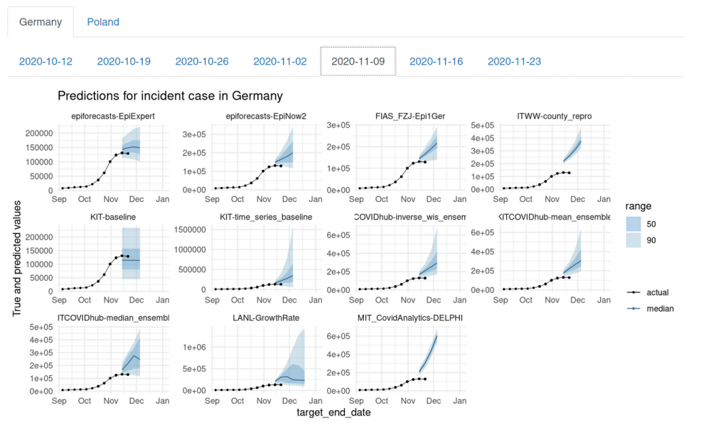
The only exceptions were the LANL-GrowthRate model (which still had exponential uncertainty) and the KIT-baseline model (which always predicts constant case numbers).
Assessing forecasts formally
Instead of only looking at the forecasts, we can assess forecasting performance more formally by using the weighted interval score. The interval score assesses predictions by measuring
score = underprediction + overprediction + sharpness.
Underprediction and overprediction are penalties that you get if the true observed value falls outside of your prediction interval. Sharpness means the width of your forecasts. You therefore get penalised if you are either wrong or to cautious and uncertain in your prediction. Smaller scores are better. The score is then weighted according to the prediction interval. This happens such that inner predictions (e.g. the median) matter more than the outer predictions (e.g. your 98% prediction interval).
Other metrics commonly used are the absolute error of the median (the absolute difference between your median forecast and the observed value) and coverage. Coverage refers to the percentage of values covered by a given central prediction interval. You would ideally want 50% of true observations to fall in your 50% prediction intervals, 90% in the 90% prediction intervals etc.
Let’s look at how we did in terms of the interval score. This plot shows the rank each forecaster achieved in terms of the weighted interval score on a given forecast date:

Indeed, seb dominates the board on 4 of 6 forecast dates. It is important to note that different forecast dates also imply different forecast horizons that are scored. The latest forecasts are only scored on a one-week-ahead forecast, as data for further forecast horizons is not yet known. Generally speaking, larger horizons carry a larger weight when determining the overall score achieved by a model. This is due to the fact that the interval score uses absolute values and scales with the overall error. Simply speaking: if you predict 1000, but the truth indeed 1200, you will get a higher score than if you predict 100 and the true value is 200. Predictions further ahead into the future are more difficult and therefore usually get penalized more heavily.
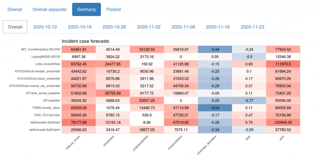
Let’s look at an overview of different metrics. The first column shows the weighted interval score. The next three columns are the components of the weighted interval score as explained above. Coverage deviation is a measure of whether our 20%, 50% 80% … prediction intervals actually cover 20%, 50%, 80% … of the true values. If the value is negative, this means that forecasts are either biased or overly confident. The second last column shows a measure of bias (i.e. is there a tendency to over- or underpredict) and the last shows the absolute error of the median prediction.
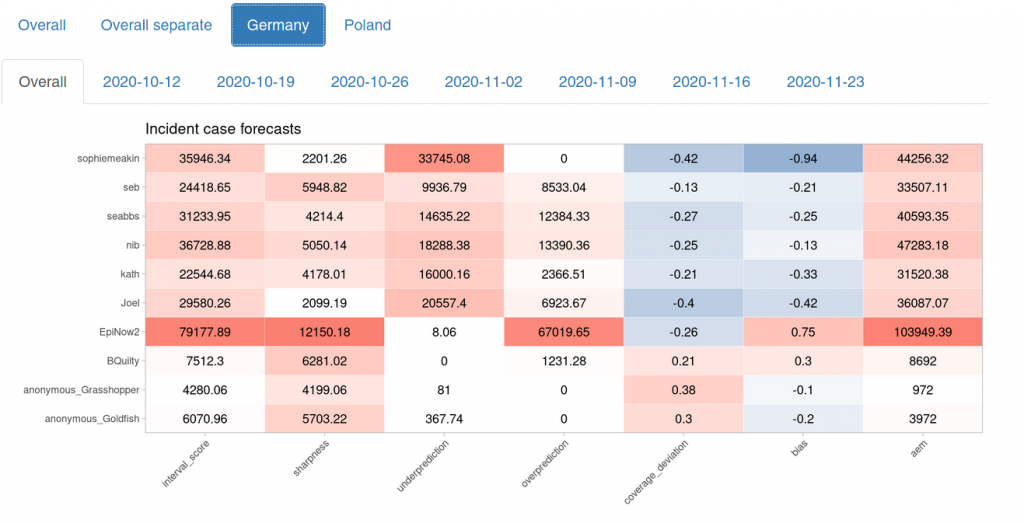
This plot illustrates the point made above about scoring different forecast horizons: The three forecasters who seem to perform best here were ones that only joined two weeks ago. There are no four-week-ahead forecasts to be scored for these forecasters and they therefore have an advantage in terms of scoring. If we look at the rank plot again, however, we can see that anonymous_Grasshopper did indeed well. One future aim is to compare forecasters in terms of relative weighted interval scores such that they are only judged against those who predicted the same targets.
We can also visualize the interval score components:
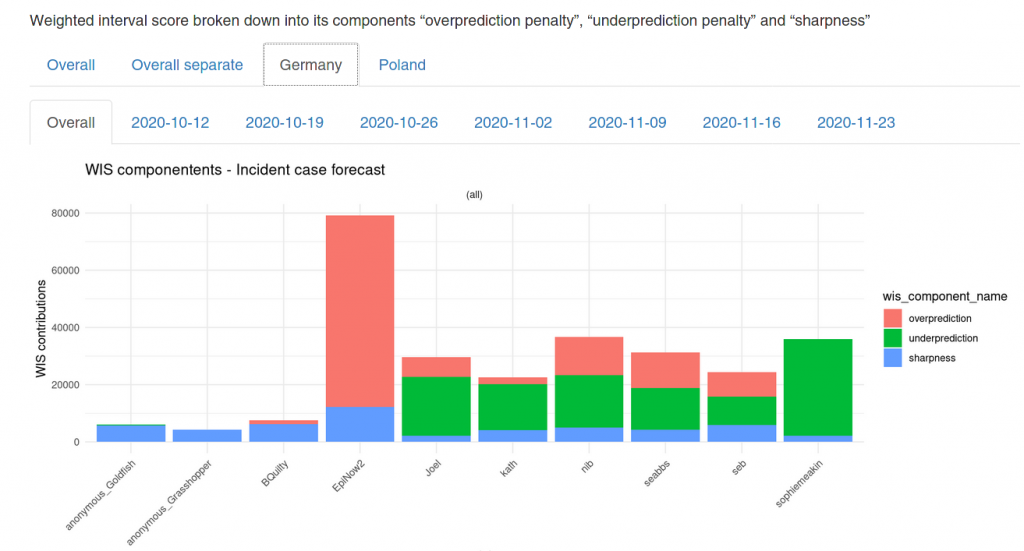
As mentioned above, the penalty component usually weighs much heavier than the sharpness component. Usually, it makes sense to err on the side of caution.
Let’s now have a quick last look on how our performance compares with the rest of the Forecast Hub (note that this not an official evaluation, but just my private go at the data):
We see that our model performed quite a bit better than the other models in terms of the weighted interval score. The only model that comes up ahead only started their predictions on 2020-11-16 and are therefore only scored on one-week ahead forecasts (for those, they were again less accurate than EpiExpert).
Summary and outlook
So far our forecasts have performed astonishingly well given that so far there were usually only about six participants with very little knowledge about the specifics of the German situation (only one of us currently lives in Germany, the rest are based in the UK). I imagine that having more domain-specific knowledge could potentially improve forecasting drastically.
It is also important to note that setting this app and running the forecasts isn’t hard. Sure, it took me quite a while to build the app and it was difficult to get all the evaluation automated. But once that was done, it took the people involved around 5-10 minutes per week to do the forecasts. Probably, the time needed to set up and properly tune a good forecasting model far exceeds that. The disadvantage of the crowd-forecasting approach is that it is hard to scale. Our research group also submits forecasts to the US Forecast Hub – but crowd-forecasting 50 states plus several US territories simply isn’t feasible. If there are, however, only few targets our approach really seems to have an edge.
In the long run I would like to continue and expand this project. I plan to add more baseline models and randomize people into which one they see first. I will continue working on the user interface and try to integrate feedback on past performance directly into the app. If you have any feedback, please create an issue on github or send me a message. If you would like to contribute to the app itself, please reach out as well. Eventually, I would like to turn the app into an R package such that anyone who likes can simply set up their own forecasting app. One interesting use cases, for example could be to predict the future trajectory of the effective reproduction number Rt.
One short term aim is increase the number of participants. On the one hand this will most likely improve forecasts. On the other hand, we need a certain amount of people to answer the other research questions outlined in the beginning. In order to make statements about experts and non-experts, the effects of differing baseline models and whether or not participants learn over time, we need a lot more individuals to obtain the necessary statistical power.
What is in there for you? You can contribute to an interesting research project. You can practice thinking quantitatively and you will get immediate feedback about your performance as a forecaster. And you can appear on our leader board and tell your friends to suck it. Isn’t that that, after all, the greatest joy in life?