TLDR
- Metaculus is a prediction platform that collects and aggregates predictions from users on a wide range of questions
- An increase in the number of forecasters seems to lead to an improvement of the Metaculus community prediction. I believe this effect is real, but due to confounding effects, the analysis presented here might overestimate the improvement gained.
- That improvement of the Metaculus community prediction seems to be approximately logarithmic, meaning that doubling the number of forecasters seems to lead to a roughly constant (albeit probably diminishing) relative improvement in performance in terms of Brier Score: Going from 100 to 200 would give you a relative improvement in Brier score almost as large as when going from 10 to 20 (e.g. an improvement by x percent). Note though, that it is a bit unclear what “an improvement in Brier score by X” actually means in terms of forecast quality.
- Increasing the number of forecasters on Metaculus seems to not only improve performance on average, but also seems to decrease the variability of predictions, making them more stable and reliable
- This analysis complements another existing one and comes to similar conclusions. Both analyses suffer from potential biases, but they are different ones.
All code used for this analysis can be found here.
Introduction
One of the central wisdoms in forecasting is that an ensemble of forecasts is more than the sum of its parts. Take a crowd of forecasters and average their predictions – the resulting ensemble will usually be more accurate than almost all of the individual forecasts.
But how does the performance of the ensemble change when you increase the number of forecasters? Are fifty forecasters ten times as good as five? Are five hundred even better? Charles Dillon looked at this a while ago using Metaculus data.
He broadly found that more forecasters usually means better performance. Specifically, he estimated that doubling the number of forecasters would reduce the average Brier score by 0.012 points. The Brier score is a metric commonly used to evaluate the performance of forecasts with a binary yes/no outcome and equals the squared difference between the outcome (0 or 1) and the forecast. Smaller values are better. Charles concluded that in practice a Metaculus community prediction with only ten forecasters is not a lot less reliable than a community prediction with thirty forecasters.
Charles’ analysis was restricted to aggregated data, which means that he had access to the Metaculus community prediction, but not to individual level data. This makes the analysis susceptible to potential biases. For example, it could be the case that forecasters really like easy questions and that those questions which attracted fewer forecasters were genuinely harder. We would then expect to see worse performance on questions with fewer forecasters even if the number of forecasters had no actual effect on performance. In this post I will try to shed some more light on the question, this time making use of individual level data.
Methodology
To examine the effect of the number of forecasters on the performance of the community prediction, we can use a technique called “bootstrapping”. The idea is simple. Take a question that has n = 200 forecasters. And let’s suppose we are interested in how the community prediction would have performed had there only been n* = 5, 10, 20, or 50 instead of the actual 200 forecasters. To find out we can take a random sample of size n*, e.g. 5, forecasters, discard all the other ones, compute a community prediction based on just these 5 forecasters and see how it would have performed. One data point isn’t all too informative, so we repeat the process a few thousand times and average the results. Now we do that for other n*, e.g. 10, 20, or 50.
That gives us a picture of how performance of the community prediction on that given question evolves as a function of the number of forecasters participating. In addition, we can also look at the variance of simulated performance. Importantly, since we obtain that information for every individual question, we circumvent the selection issue of the initial analysis. If we see an effect of the number of forecasters on the performance of the community prediction, we can be a bit more confident that this isn’t due to inherent differences in question difficulty.
Results using only aggregate level data
Before we dive into the individual level analysis, I want to repeat some of the analysis that Charles did in order to get a broader picture. No bootstrapping yet. Here is a plot with all the questions and corresponding scores at the time the last forecast was made, so right before the question was closed.
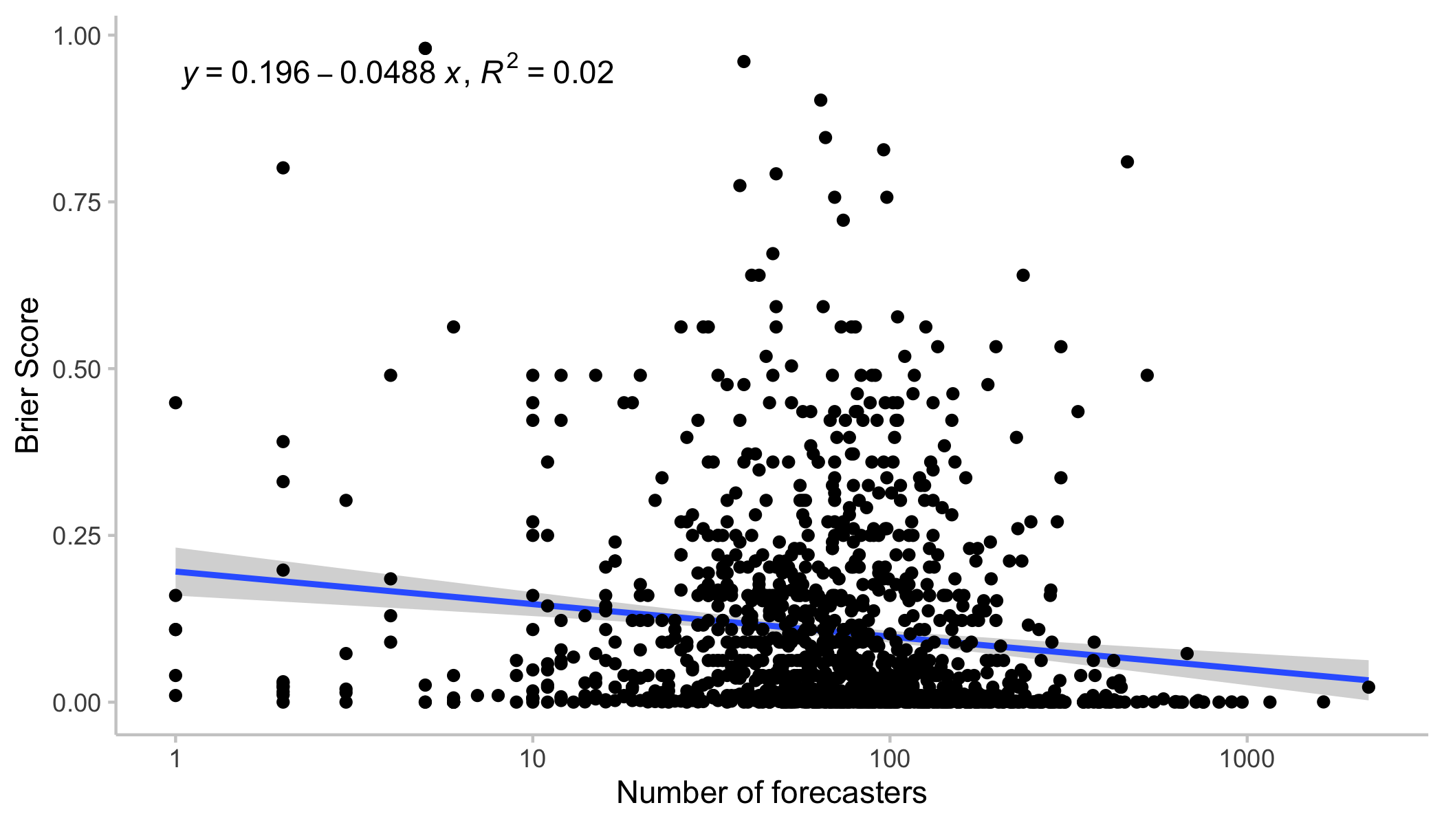
We see something that could charitably be called “a relationship” between expected scores and the number of forecasters. Nevertheless, these points are all over the place and we also haven’t controlled yet for any selection biases.
In his post, Charles does some clever filtering of the data. He omits questions that resolve more than a year into the future (less reliable) and also only looks at the first 25% of the prediction time. That reduces issues that may arise due to changes over time: forecasting early is usually harder than forecasting late and predictions made at the beginning may not be comparable to forecasts a lot later.
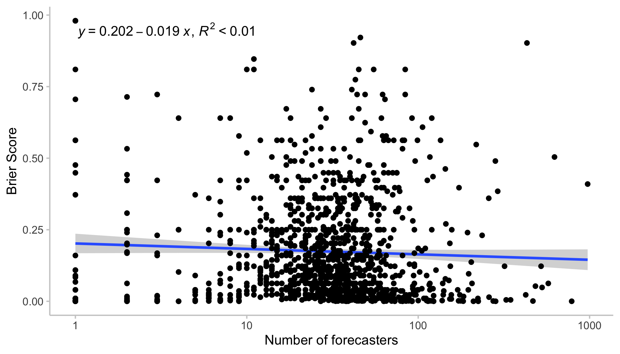
I’m using a similar filter for most of my individual level data analysis: I also only looked at forecasts made within the first 25% of the overall lifetime of any given question. After applying that filter, I additionally removed any question in which the time between the first and last forecast was over a year.
The following plot is the same as the one above, but with that filter applied. So what we see is scores for the community prediction made at (or near) 25% of the overall question lifetime. The picture is similar, albeit the effect even less clear.
Things may look different for certain subsets of the data
But maybe the effect of increasing the number of forecasters is different for lower number of forecasters than higher ones? Let’s look at only those questions that have attracted more than 100 forecasters. When we look at scores for the community prediction restricted to the first 25% of the question lifetime (left), the trend seems to disappear (and might even go the other direction). When we look at the community prediction at closing time (right) not that much changes.
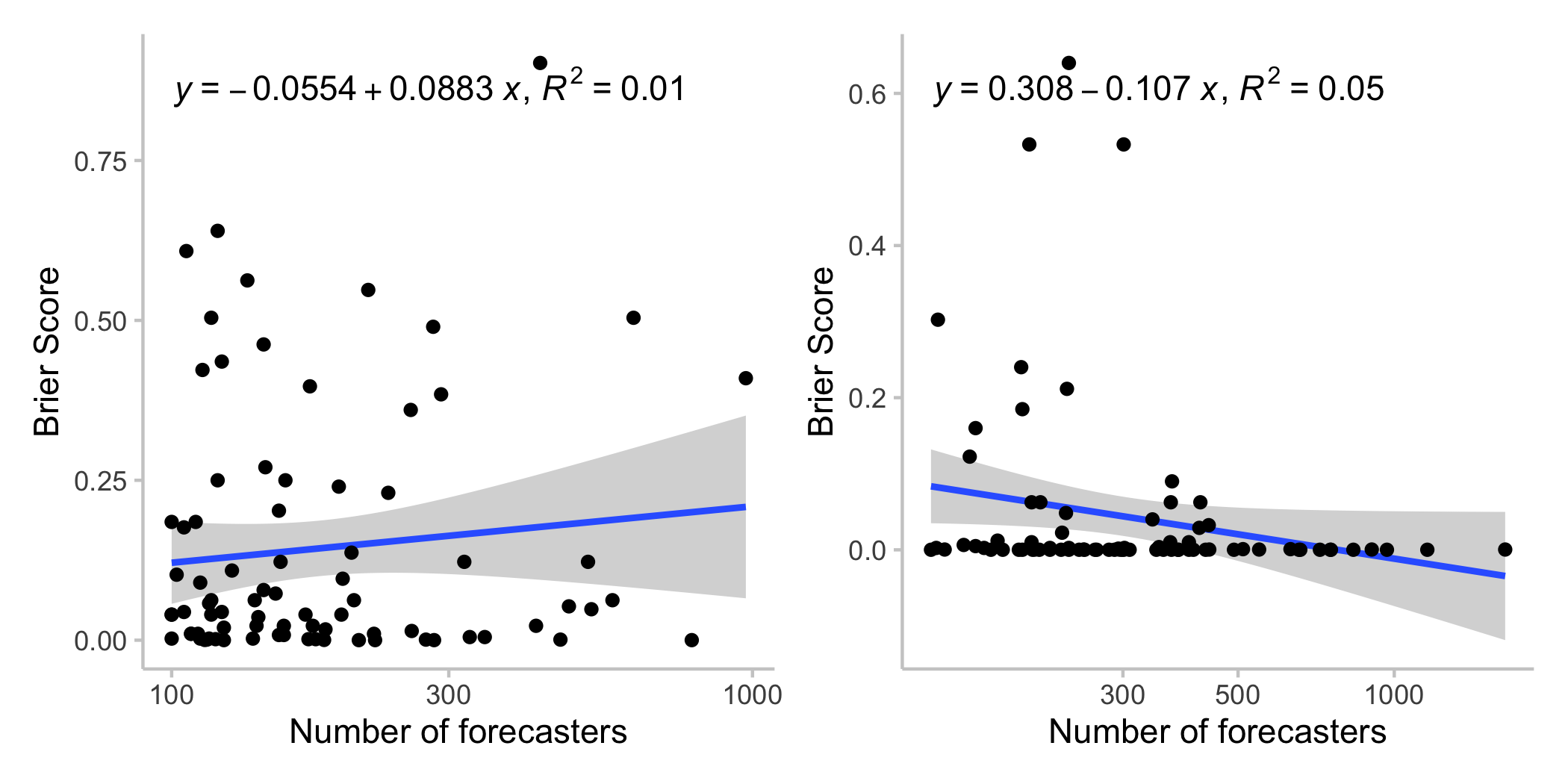 All of this should be taken with a grain of salt. Regressions like these are notoriously susceptible to outliers. But it’s important to keep in mind that more predictors can also mean lower forecasts quality, since questions, especially on hot political topics, can be swamped by inexperienced forecasters. This may be less of an issue at the end of the question lifetime when the outcome seems clearer (average Brier scores of the community prediction at the end of the question lifetime (right plot) seem very low overall).
Results using individual level data
Now let’s do the bootstrapping. The data, again, is restricted to forecasts made within the first 25% percent of a question lifetime, and in addition to questions for which this time is not longer than a year. In addition, I only looked at questions that had at least 150 forecasters in that time, in order to bootstrap different numbers of forecasters.
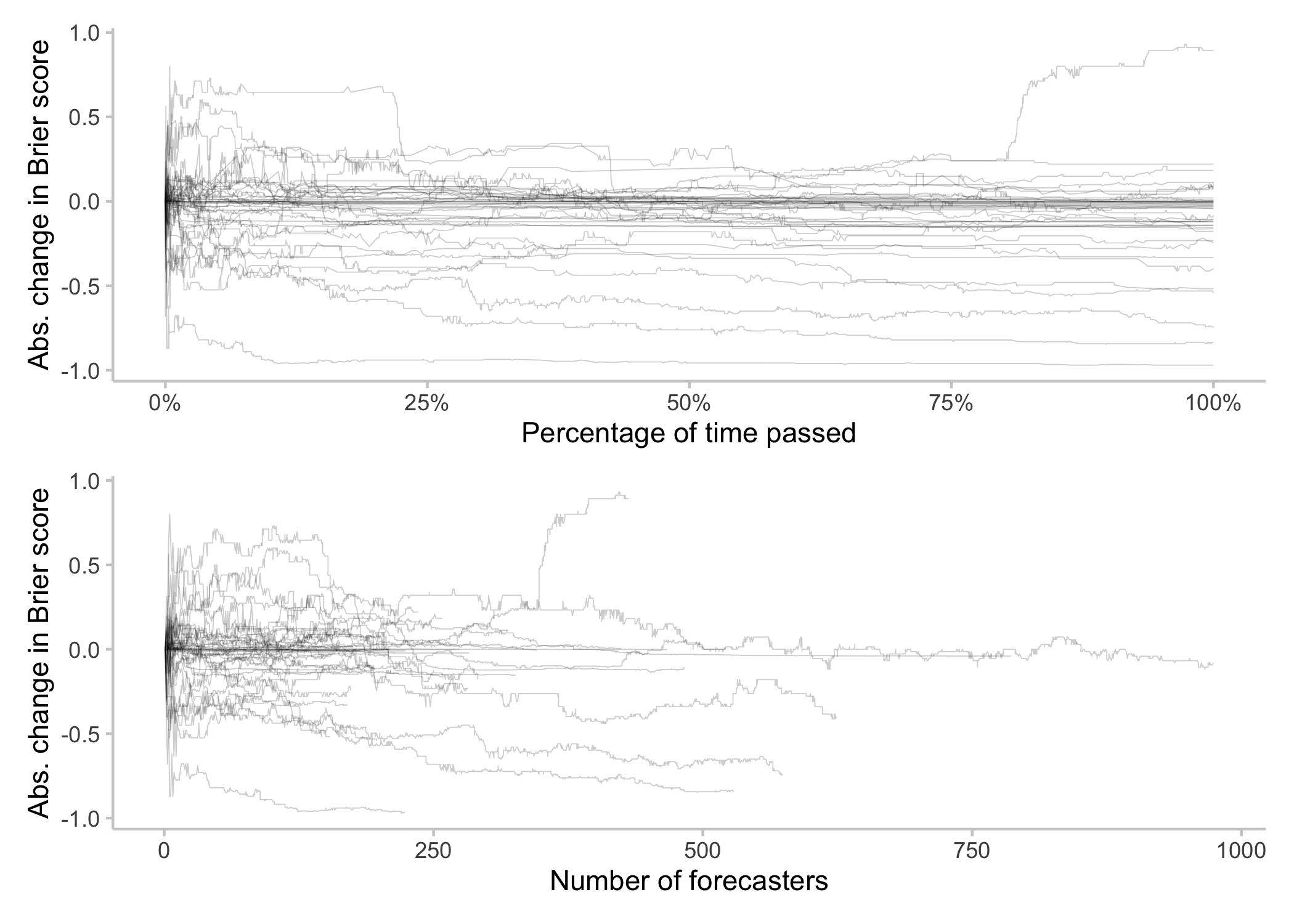
The following plot shows how performance of the community prediction evolves as a function of the number of hypothetical forecasters. One line represents one question. For any individual question, samples were drawn with different sizes (representing the number of hypothetical forecasters). 5000 samples were drawn, the community prediction and the corresponding Brier score computed, and the results averaged. So every line represents the average across 5000 simulations for different numbers of forecasters for a given question. To make the charts more legible I subtracted the Brier score for the lowest group size, n* = 5 forecasters, from all calculated scores (top), or divided the score by the score for n* = 5 (bottom) to get relative changes. [1]
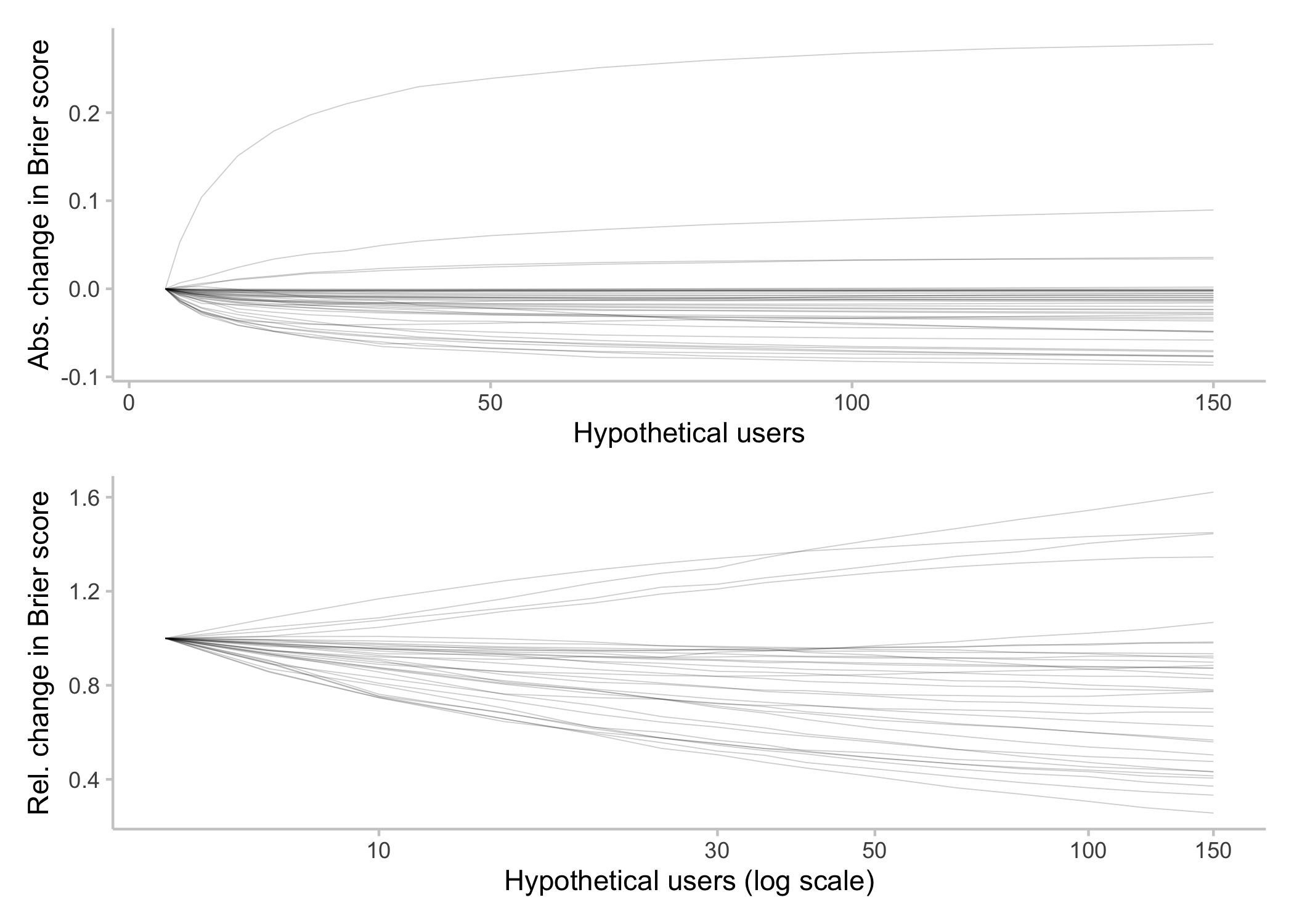
Generally, it seems like overall more forecasters seems to improve scores (we’ll get to the few weird lines where scores increase with an increasing number of forecasters later).
Let’s now look at average scores (that is, averaged across all questions) as a function of forecasters. The top shows the average Brier score, while the bottom shows the average relative change in Brier score. Just like above, I divided all Brier scores for a given question by the Brier score for n* = 5 to get relative changes, and then averaged them across questions.
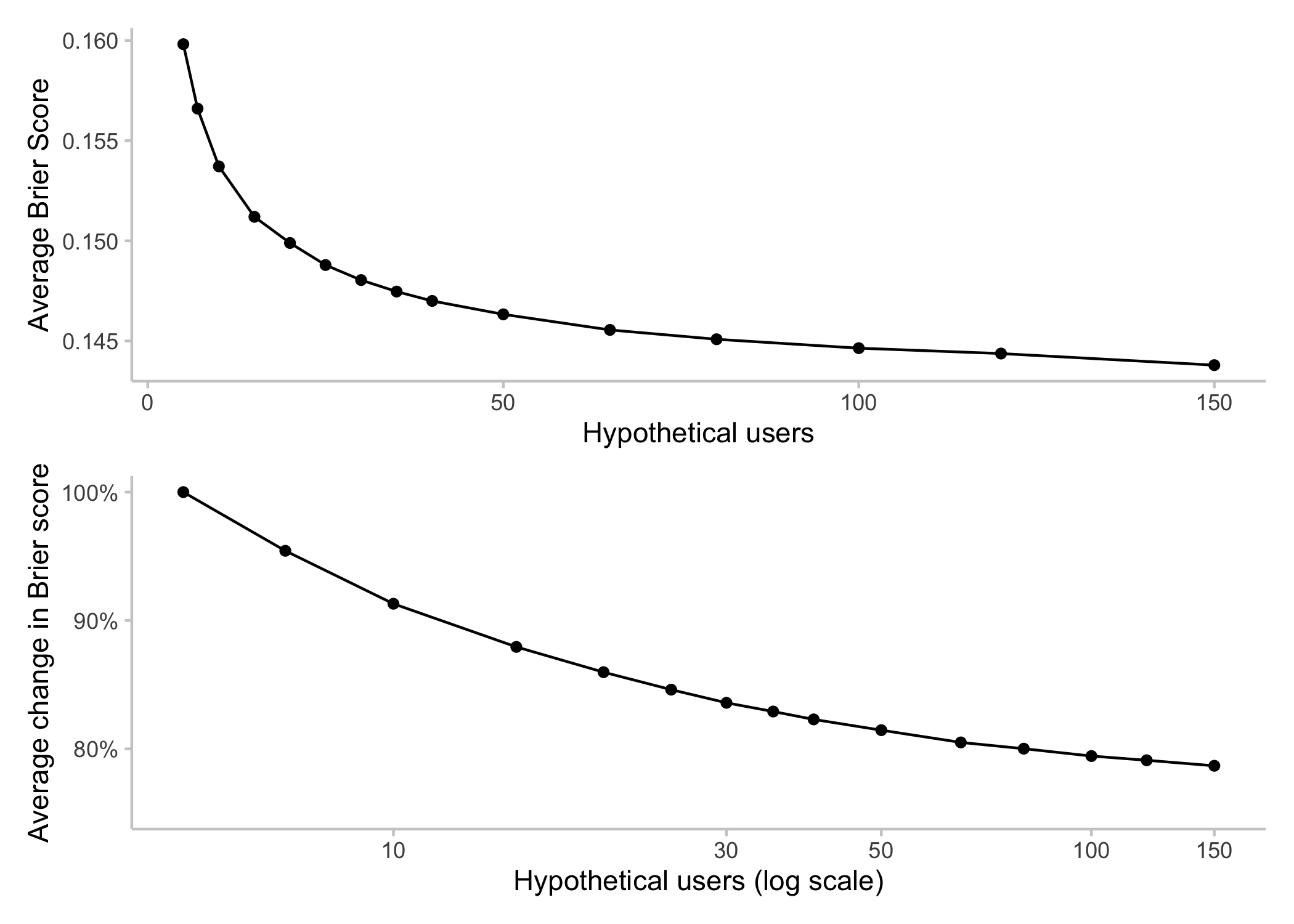
Again, increasing the number of forecasters seems to have a noticeable effect. Please don’t focus too much on the actual numbers in the bottom plot with the average change in Brier score. Relative improvement, i.e. a ratio of one score over another, are notoriously tricky. An improvement from 0.05 to 0.01 looks much better on a relative scale than an improvement from 0.3 to 0.2. In order to reduce the effect of a few outliers, I removed all Brier scores < 0.01. Had I chosen another cutoff, or no cutoff at all, the curve would have looked different and it’s not clear what the “correct” curve is. The interesting point here is therefore more that improvements seem to persist even for larger numbers of forecasters. That relationship seems to be more logarithmic than linear: If you double the number of forecasters from 100 to 200, it seems you can get a relative improvement (i.e. by X%) almost as large as when you double from 20 to 40. This, of course, is only a statistical relationship. It’s hard to say what an improvement in Brier scores by X% means in terms of forecast quality or the value they provide.
Reliability of forecasts
Let’s look at another interesting aspect: reliability, or rather variance, of scores across simulations. A high variance implies that sometimes scores are really good and sometimes they are really terrible. A low variance implies that we can more or less trust that performance will be what we expect it to be. The following plot shows the variance of simulated scores across different for numbers of hypothetical forecasters. Again, one line represents one question. [2]
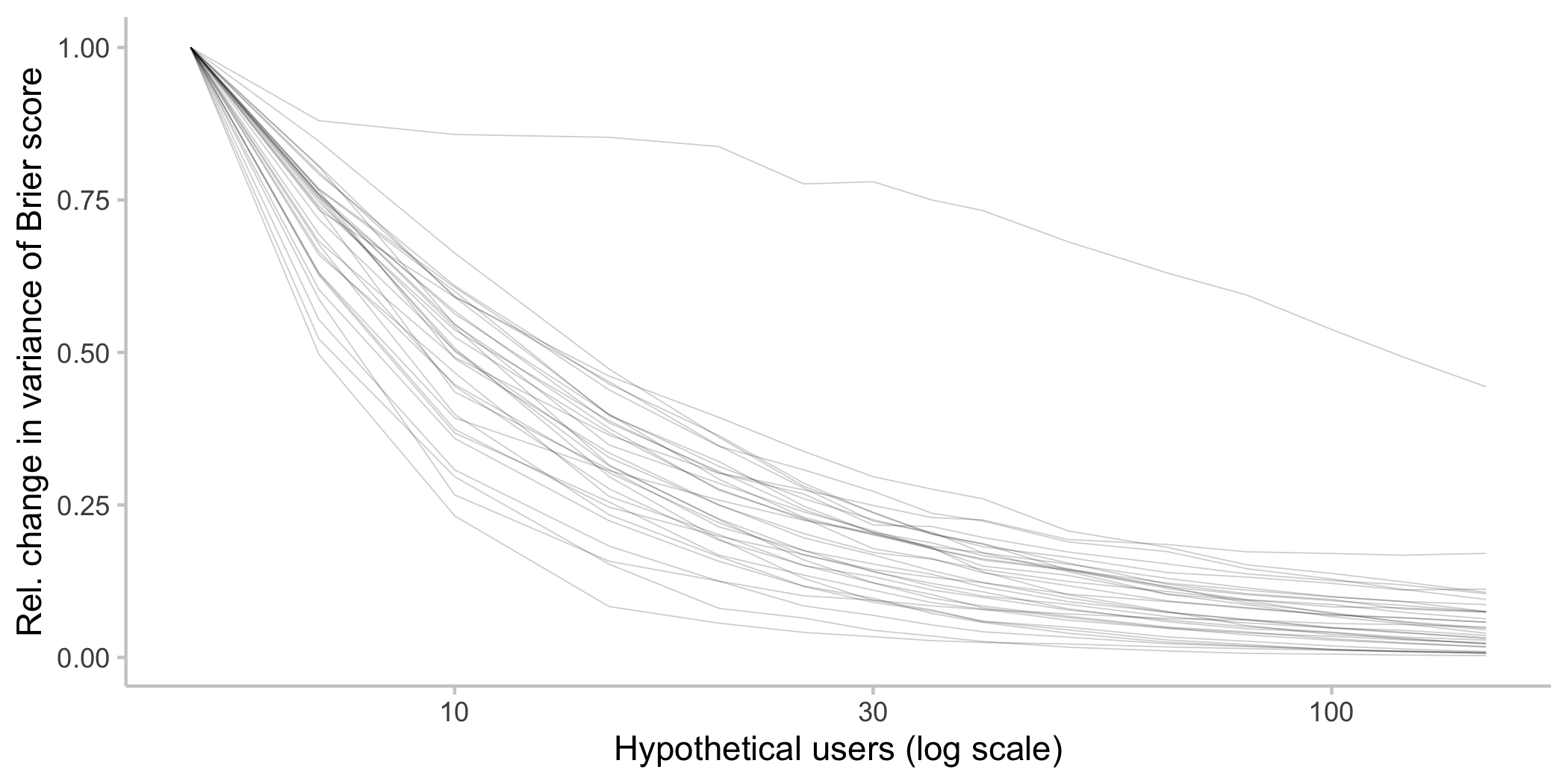
We see that variance decreases sharply initially when increasing the number of forecasters and doesn’t change that much after approaching 30. Taken at face value that would imply that with around 30 forecasters, we can be somewhat confident that performance will be somewhat consistent (note that this number is slightly higher than the ten that Charles found).
Of course that analysis is somewhat flawed: we are only looking at the variance of simulated scores, which may differ from the variance of forecasts in the real world. If, for example, we kept increasing the size of the sample we draw, then eventually the variance would be guaranteed to go to zero (when the sample size equals the total number of forecasters and there is only one possible sample we can draw). EDIT: For an initial version of this piece I sampled without replacement, which this sentence was referring to. I eventually switched to sampling with replacement, but results overall hardly changed.
My personal gut intuition is nevertheless that results overall might look kind of similar in the real world, but the above plot doesn’t prove it.
Limitations
My experience from the data analysis process is that actual numbers and numerical estimates varied quite a bit depending on how you filter the data. The overall picture seemed consistent, but details changed depending on how you filter the data. I’m therefore refraining from giving precise numbers.
Time as a confounder
The biggest limitation with the analysis I presented is that it confounds the effect of increasing the number of forecasters with the effect of time. The reason is that new forecasters come in over time and make their predictions at different times. But also, answering a forecasting question gets easier the nearer you come to the resolution date. If we only sample a small number of forecasters, we have a good chance of only looking at “older”, and therefore worse forecasts.
Here is a graph showing the relationship between number of sampled forecasters and the average timing of the newest included forecast. For every simulated sample, I stored the time of the newest (most recent) forecast included in that sample. I then converted the time to a percentage of the overall time span in my data set for that particular question (the 25% of the overall question life time that I’m looking at corresponds to 100% of the time in my dataset) and took an average across samples. Every line is again one question and the black line is the average across questions.
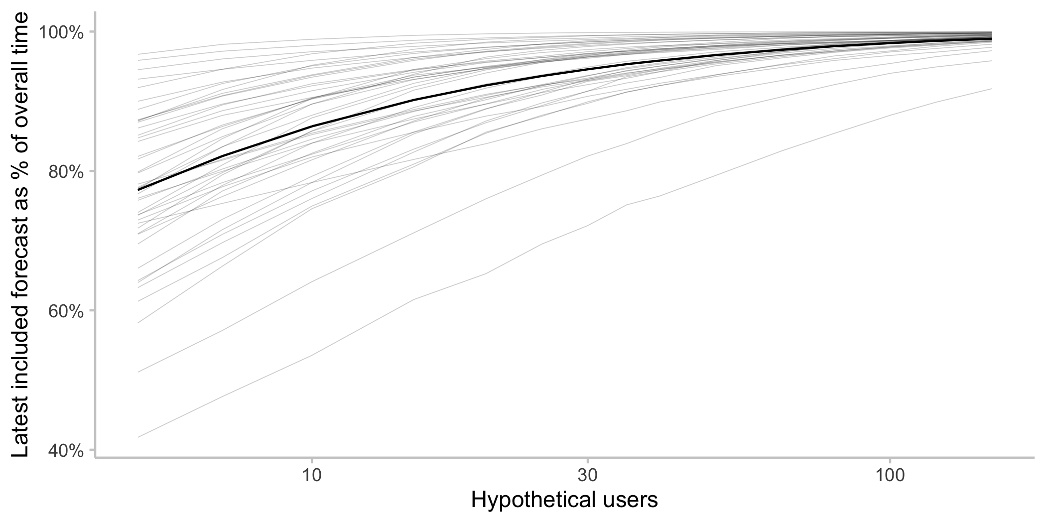
We see that when we draw a bootstrap sample with a small number of forecasters, there is a good chance we miss the newest forecasts. When we sample only a small number of hypothetical forecasters, we sometimes end up with newer forecasters and sometimes with older forecasts. When sampling a larger number of hypothetical forecasters we will almost always have a mixed bag, including newer ones. Usually older forecasts will tend to be worse, because it’s harder to predict far ahead into the future.
When sampling a small number of forecasters, the resulting community prediction will sometimes be unusually good and sometimes unusually bad – we increase the variance of the forecast. But since the Brier score is the squared distance between forecast and observation, bad forecasts will drag the average down so we end up with worse scores. An increase in variance of the forecast will usually always make average scores worse, and the temporal component is a factor that increases forecast variance.
In addition, the Metaculus community prediction has some recency weighting and it therefore matters whether a sample includes newer forecasts or not. The improvement we saw for an increase in the number of forecasters could therefore in part be explained by the fact that samples of forecasts from a large number of hypothetical forecasts are more likely to include more recent forecasts.
I think this confounding effect between time and the number of forecasters is what happened with the line where scores were increasing (deteriorating) as we increased the number of hypothetical forecasters. This is the corresponding question:
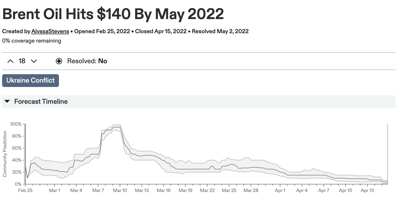
The time we looked at is the first 25% of the overall question life time, so roughly the time until March. You can see that forecasts around March 10 were quite different and more wrong than the ones made on February 25. It’s now easy to see that increasing the number of forecasters (therefore making sure that all the latest forecasts in March are included) would make scores worse.
Despite time as a confounding factor I still think that the overall effect is real and that increasing the number of forecasters really does improve performance. In broad strokes my analysis confirms what Charles found. Both analyses suffer from potential biases, but they are different ones. So that is two somewhat independent data points pointing in a similar direction (although based on almost the same underlying data…).
Due to the confounding effect of forecaster timing, my intuition is that the bootstrap analysis slightly overestimates the improvement gained by adding more forecasters.
I tried a bit to disentangle the effect of an increasing number of forecasters and time. Here is a plot that shows the change of Brier score (compared to the very first forecast) as a function of both time and the number of forecasters (applying again the same filters as above). With some imagination I think one could say that the number of forecasters has a stronger effect, but I find it really hard to tell. If you have ideas for how to separate these effects in future analyses, please let me know.
Forecaster composition
Charles’ original analysis was prone to potential biases due to selection effects. Forecasters might prefer easier questions, and therefore easier questions could find themselves with more forecasters. The bootstrap analysis controls for this by keeping the pool of forecasters constant and focussing only on the effect of adding more forecasters from that given pool of forecasters. While Charles’ analysis answers “How much can you trust a question with X forecasters”, this analysis tries to answer “what happens to performance if you add more forecasters to the ones that you already have”.
This is a relevant question if you’re thinking about how hard you should try to drive engagement on a forecasting question. The problem, in practice, is that the bootstrap analysis might give you a misleading answers (in addition to all the caveats about time as a confounder outlined above). It gives you the effect of adding a forecaster that is in some sense similar to the ones you already have (i.e. drawn from the same overall population). However, when you go and post your question on Twitter to attract new forecasters, these forecasters might be very different from the ones you have already. In that case they are, statistically speaking, drawn from a different population. If adding new forecasters meaningfully changes the overall composition of forecasters, then the bootstrap analysis can’t give you accurate answers anymore.
Further research
One important bit missing from both my and Charles’ work is a comprehensive review of existing literature on that topic. I have a sense that the observed effect of adding new forecasters might be different if we look at different platforms and contexts. For example, this analysis only looked at binary questions and the picture might look quite different for continuous questions. Getting a better sense of what other people have found would be really important.
For the Metaculus hackathon, one project looked at accuracy of tournament questions vs. non-tournament questions. It found that tournament questions had significantly more forecasters, but interestingly didn’t observe the same performance-participation relationship Charles and I found. I suspect that confounding factors like the timing of forecasts, the composition of the pool of forecasters etc. play an important role that we haven’t fully understood yet. Investigating these factors in more detail would help get a more accurate and reliable picture.
This is a very interesting article. I enjoyed reading it.